Problem:
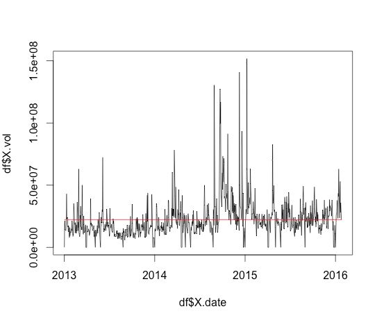
In our last post we read in the historical share information about a company, in this post I want to plot the daily share volume amounts against a line indicating the average volume.
Solution:
> df <- read.csv(‘tesco.txt’)
> str(df) #look at the structure of the dataframe
If you look at the data type of X.date you will see it is an int. We want to convert this to a proper datetime. I had a few issues with this, and it seems to be as it has been read in as an int when you try to convert it, it thinks it is a milliseconds value. I got around this by first converting the int to a char
> df$X.date = as.Date(as.character(df$X.date), “%Y%m%d”) #convert to date
> df$X.Avg <- mean(df$X.vol.) #create a new column and store the average volume
> plot(df$X.date,df$X.vol, type=”l”) #draw a line graph, l is for line
> lines(df$X.date,df$X.Avg, col=”red”)
It would be nice to get the axis names sorted out, and the formatting of the numbers.